Telling users something without stopping them to do it.
John Gruber published a piece this week coining the term dickover: a modal or curtain that obscures an app or website’s own content to force an unwanted interaction. Cookie banners, newsletter subscribe walls, “install our app” sheets. He’s right, obviously. They’re everywhere and they’re infuriating. Worth a read if you haven’t seen it.
I’ve been making Did It for a few months now and one of the questions I ask myself regularly is “what would John think of this?” He has strong opinions about native apps, ones I wholeheartedly agree with and try to live up to. Did It is built in React Native, which means I’m on the back foot already, but holding onto the question helps me make sure the app feels considered and respectful of the people using it.
The app has things it occasionally needs to tell you. There’s an update available. Something changed in the new version. I’d love to hear how you’re using it. None of these are critical. None of them should interrupt what you came to do.
Push notification was off the table. Did It already asks for notification permission for the daily reminder feature. Using that channel for “hey, there’s an update” would be a misuse of something people opted into for a specific purpose. A modal on launch had the same problem the other sheets have. You came here to log something, not to be briefed.
So I built a pill. A small rounded label that sits above the tab bar. It only appears on an empty day. If you’ve already added entries, you’re using the app, and the last thing you need is something else competing for your attention. An empty day is the one moment where there’s genuinely space for a gentle nudge.
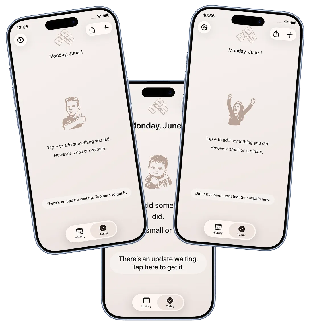
The update version of it reads: “There’s an update to Did It. Tap to get it.” Tapping opens the appropriate app store.
The way it works: there’s a small JSON file on the website that I update manually once a new release has been approved by Apple or Google. The app fetches it in the background and compares the version there against the one installed. If the store version is newer, the pill appears.
I had to explicitly ensure the pill scales to accommodate larger system font sizes and longer localisations of the pill messages. The default always seems to be fixed-height pills that assume a particular font size so would either clip text or look broken at the extremes.
Once the pill existed, a second question opened up. When someone updates, how do they find out what changed? Store release notes exist but only the crazy ones like me read them there.
The pill handles this too, but through a completely separate mechanism. On the first session after an update, the app compares the installed version against the last version it was launched with, a value stored on device. If they differ, it shows a different message: “Did It has been updated. See what’s new.” Tapping opens the release notes page on the website in an in-app browser. No website update needed, no manual step. It fires automatically because the version bump itself is the trigger.
The two mechanisms are easy to conflate because they use the same pill, but they’re independent. The version.json file tells the app a newer version exists in the store. The on-device version comparison tells the app the user just updated. One looks outward, one looks inward.
There was a small wrinkle. On a fresh install, the on-device “last launched version” doesn’t exist yet, which would incorrectly trigger the “what’s new” flow for brand new users. The fix was to check against the first-ever launch timestamp. If it was set more than a few minutes ago, you’re an upgrader. If it was just set, you’re new. Small detail, but the kind that matters.
Only one pill shows at a time, and only on an empty day. When I added a third use for it, a feedback prompt, that ordering needed to be explicit. A newer version available takes priority because it’s the most directly useful thing the app can tell you. What’s new is second, while the context of a recent update is still fresh. Feedback is last, always optional, always deferrable.
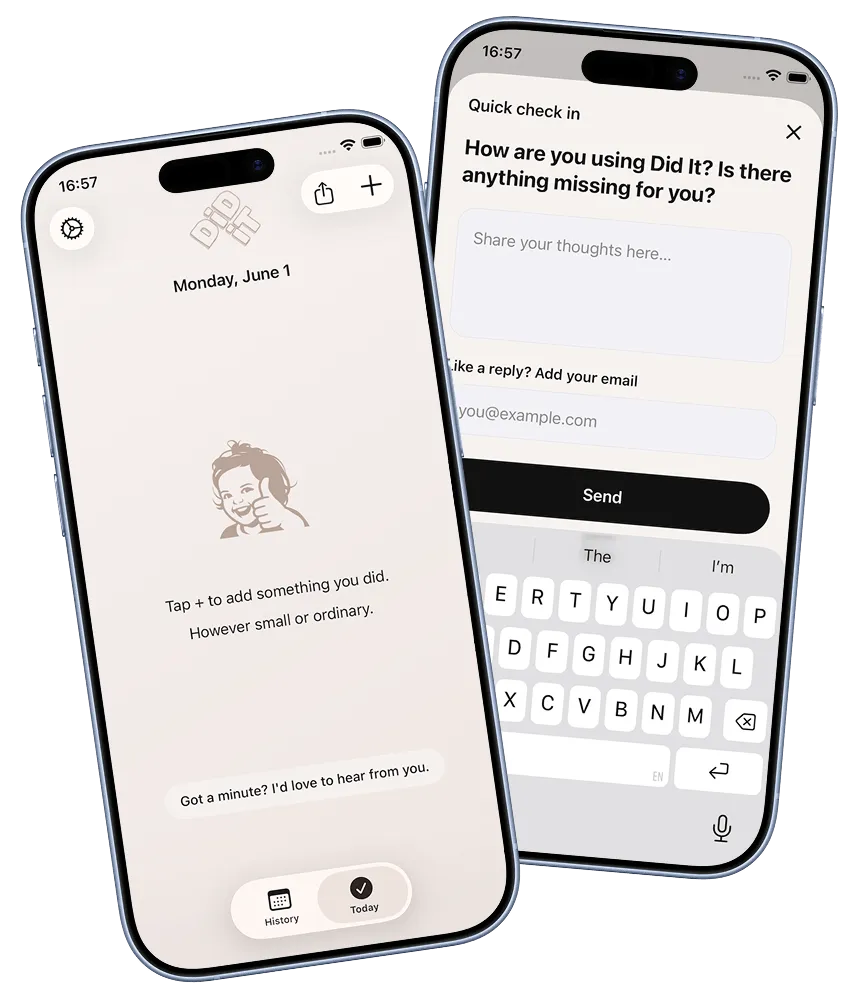
The feedback prompt is remotely controlled via a JSON file on the website, separate from the version one. It carries the question, an ID, a date window, and a live flag that defaults to false. I have to explicitly turn it on, which means I can write a question, push it, test it in the simulator, and only make it visible to real users when I’m confident in it. Tapping the pill opens a bottom sheet with the question and a text field. There’s an optional email field if someone wants a reply.
The feedback system turned out to have considerably more depth than a single article can do justice to, including support for single and multiple choice questions, platform and version targeting, and a few other things. That’s probably worth its own post. But the core of it sits on the same foundation: a pill on an empty day, a sheet if you tap it, and a very easy way to ignore it if you don’t.
Before I shipped this I wanted to test whether the pill was actually noticeable. The worry wasn’t that engaged users would miss it, it was that the people who never read the UI, who just open the app, do the thing, and close it, wouldn’t see it at all. Those felt like the real test. If the pill could catch their attention without being loud enough to annoy them, it would probably work for everyone else too. I tried it on a few people I know who use apps exactly that way. They tapped it. That was the reassurance I needed.
Which brings me to the places where I’m not as consistent. Did It has three moments where it interrupts you with a sheet you didn’t ask for. After your third entry, the native iOS rating prompt fires. About 24 hours after your first launch, a sheet appears suggesting you turn on notifications. A day or so after that, another one points you towards the widget and lets you personalise a few settings.
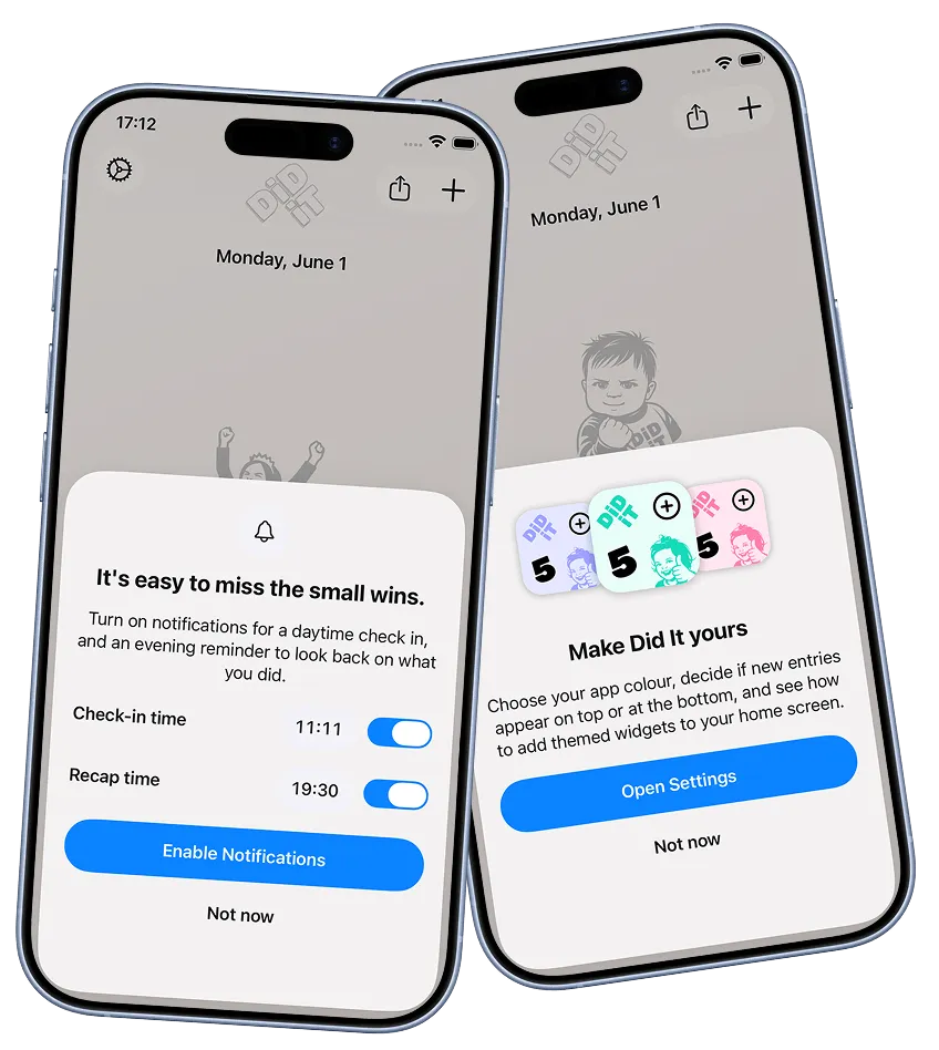
All three felt justified at the time. Ratings matter for visibility when you’re a tiny app nobody’s heard of. Notifications are genuinely useful to people who forget to log things. The personalisation sheet surfaces things that improve the experience but that most people would never find unprompted. I made the calls.
But holding them up against the pill, the differences are obvious. The notification and widget sheets are at least offering something useful to the person being asked. The rating prompt is mostly useful to me. I’ve had around 15 reviews from it, which is not a lot for the interruption it causes. I’m not sure I’d make the same call again. All three are things I’d like to revisit, and I think the pill points to how.