I wanted a day of entries to feel special.
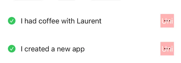
The first working version of Did It was a simple done list. A green checkmark and text alongside. It was the baseline to prove the storage model worked. But it was never going to ship.
The entry form had date and time, both defaulting to now, so there was no real burden on the user. But entries stacked at the top of the list as you added them, so the time was immediately meaningless. I thought about chronological sorting but it felt like solving the wrong problem. More UI, more choices, for something that probably didn’t matter.
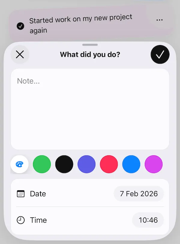
I killed time. Even an automatically updated field is still cognitive overhead if you’re looking at it.
If it creates friction without creating value, it shouldn’t be there.
With the form stripped back, I started thinking about how a day of entries actually looked. I wanted a list to feel like something you’d want to look at. Not a log. Not a checklist. Something closer to a scrapbook page, or a shelf you’d actually glance at. The word I kept coming back to was artistry. A bit pretentious, maybe, but it was driving decisions. The list needed to reflect the owner’s day, their life, something human.
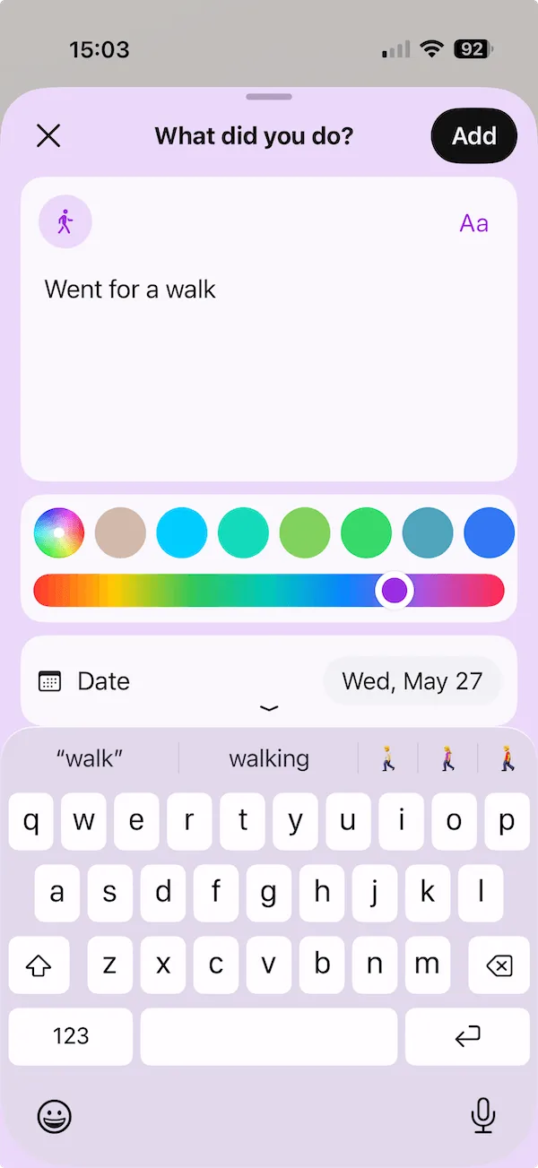
To achieve this I added a small random rotation to each entry, a few degrees either way, and then gave each entry a colour.
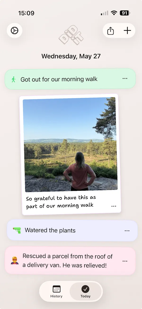
The colour isn’t random in a hands-off sense. When the entry sheet opens, the app picks a colour based on where the entry is most likely going to land. If you’re about to add to the bottom, it’s picking relative to whatever’s already sitting there. The constraint is that no two adjacent entries end up the same colour. That sounds simple but the list has two ends, and entries can arrive at either depending on how you’re adding them (pull gesture, widget, the + button). Getting the adjacency logic right for all of those paths took longer than I expected.
Users can always tap the colour swatch and change it. But the default is meant to be good enough that most people never need to.
Each entry also has an icon. Getting that to feel useful without getting in the way became its own rabbit hole. There’s a whole post about it.
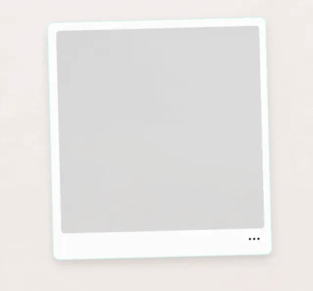
Photo entries came later and required very deliberate care as I wanted these to increase the artistry of a day. The polaroid style felt like a natural choice to me, informal, fun, quirky, and suits the squiffy layout.
The basic problem: photos don’t arrive instantly. Importing, resizing, storing, there’s a pipeline, and even when it’s fast it’s not immediate. They can be added from outside the app too, adding to the delays (app waking up). I didn’t want a spinner. Spinners say “wait”, and I didn’t want the photo to just appear.
I watched a lot of Polaroid development videos. Slowed right down, there’s a specific sequence: the image comes in overexposed first, almost all white, then gradually the colour arrives, the contrast settles, detail comes in last. I built something close to that. When a photo is added, the app immediately shows the first low-resolution pass, brightened, with a slight bloom or glare to it. As the full image finishes importing in the background, it crossfades in and replaces it. The whole thing is maybe a second and a half, two seconds at most. Most of the detail is in the first half second.
So in that window you have: the white flash of the initial import, a slightly overexposed ghost of the photo already sitting in the list, and then the real image arriving as the processing finishes. It’s meant to feel like the Polaroid moment of uncertainty before the image commits. Whether that reads or not probably depends on whether you’ve ever watched a Polaroid develop. Either way it’s a gentler transition than a photo just appearing.
I burned a lot of cycles on this. Getting the photo picker to appear quickly (not guaranteed), getting the import pipeline to not block the UI, and getting the animation to time correctly with when the real image was actually ready. The Polaroid thing is subtle enough that if any of those pieces were off, it would just look like a glitch.
I later added captions support after realising people would add a photo and then a text entry below it. Obvious in hindsight.
Moving entries has gone through the most iterations of anything in the app, and it’s still not perfect.
The problem is that entry heights are dynamic. Text wraps. Photos are taller. When you drag something, everything else has to move out of the way, and if the sizes are all different, calculating where things should go gets complicated. Early versions worked, in the technical sense. But they felt brittle, like the list was reluctantly tolerating you.
It’s much better now. More fluid. You can drag to the edge of the screen and the list scrolls underneath while you hold the entry. When you drop an entry between others, they push aside with a little resistance and bounce back into place. The same bounce happens when you delete an entry, the remaining ones settle into the newly available space. It sounds like a small thing but without it the list feels inert. That bit of physical personality is what makes it feel like your list rather than a database.
Even that took a lot of back-and-forth to feel right. At some point it stopped feeling like a utility and started feeling like something you could play with. That shift matters, because the ordering of entries is partly expressive. It’s how you shape a day.
A day of entries now looks obvious. This is how it should have been from the very beginning. Without a huge amount of back-and-forth negotiating with an AI coding agent, exploring, starting over, educating, it would never have got here.